


Best Quality Tableau Desktop-Certified-Associate Exam Questions Dumpexams Realistic Practice Exams [2021]
Critical Information To Tableau Desktop Certified Associate Exam Pass the First Time
NEW QUESTION 24
Connect to the Olympic Athletes data source, which athlete won at least one gold in 2008 Olympics and then won at least 4 golds in 2012 Olympics.
- A. Missy Franklin
- B. Michael Phelps
- C. Usain Bolt
- D. Dana Vollmer
Answer: B
Explanation:
Find out how many gold medals each athlete won in the 2008 Olympics
Graphical user interface, text, application, website Description automatically generated
Drop Athlete to Rows and 2008 golds to the Text. Drop gold medals to the view. Your view will look like this:
Graphical user interface, text, application Description automatically generated
Now we need work on "won at least 4 golds in 2012 Olympics"
Drop years to filters and select 2012.
Drop Gold Medals to filter and mention 4 in range of values (as we need to find athletes who won at least 4 gold medals) Graphical user interface Description automatically generated
Final view:
Graphical user interface, text, application, chat or text message Description automatically generated
NEW QUESTION 25
Connect to the "Kiva Loans - India" data source, create a chart using the continuous disbursed month (Disbursed Time field) and sum of the loan amount, exclude the null values. What is the skewness of this chart?
- A. .51
- B. .42
- C. .55
- D. .48
Answer: B
Explanation:
Enable the Summary Card from Show/Hide menu as shown:
Skewness is .42
Graphical user interface, chart Description automatically generated
NEW QUESTION 26
When it is recommended to create multiple table extracts?
- A. None of the above
- B. If we are using extract filters to limit the data
- C. If incremental refresh is configured
- D. If row-level security needs to be enforced
Answer: D
Explanation:
It is recommended to create multiple table extracts when row-level security needs to be enforced.
Refer:
https://www.tableau.com/about/blog/2018/10/you-can-now-choose-multiple-table-storage-extracts-94776
NEW QUESTION 27
Connect to the "Significant Volcano Eruption" data source. What is the interquartile range of the distribution of Total Injuries data of the 21st century (show null values at default location)?
- A. 0
- B. 1
- C. 2
- D. 3
Answer: D
Explanation:
Drop year to filter shelf and select from 2000.
Graphical user interface Description automatically generated
Drop Total injuries field to rows, go to Analysis -> Aggregated Measures (Untick this, it will disaggregate the total injuries field.
Click on Show Me, and select Box and whisker Plot.
IQR = Upper hinge - Lower hinge
Graphical user interface Description automatically generated with low confidence
Here IQR = 32 -2 = 30
Topic 1, Exam Pool B
Download the Dataset from here:
https://drive.google.com/file/d/1z7LPBQNPWHChteShl0QL3yu_JcvstLGl/view?usp=sharing
Use the above data set to answers the questions under Exam Pool B.
NEW QUESTION 28
Connect to the Olympic Athletes data source, find out the average age of players who won at least one gold medal for the country?
- A. 26.41
- B. 26.02
- C. 26.72
- D. 26.33
(Correct)
Answer: D
Explanation:
Drop the Age to the columns and change the aggregation to AVG.
Drop Gold Medals field to filter and select All values ->
Graphical user interface, text, application, email Description automatically generated
Change 1 from 0.
Graphical user interface, application Description automatically generated
NEW QUESTION 29
You have connected to the employee table in your data source and are adding a join on the Employee Manager table. If you would like to see all of the records from the employee table and only matching records from the employee manager table. Which join type will you use?
- A. Left join
- B. Inner join
- C. Outer join
- D. Right join
Answer: A
Explanation:
When you use a left join to combine tables, the result is a table that contains all values from the left table and corresponding matches from the right table.
Refer Join Types: https://help.tableau.com/current/pro/desktop/en-us/joining_tables.htm
Topic 2, Exam Pool C
Download the Dataset from here:
https://drive.google.com/file/d/1hGTUYyq6Y7DLt-DwxVaR4tNLS-FYvD22/view?usp=sharing
Use the above data set to answers the questions under Exam Pool C.
NEW QUESTION 30
Connect to the "Life Expectancy at birth" data source, combine sheets Data_20th century and Data_21st century. Find the moving average for the average life expectancy for 10 years before 2000 and 10 years after
2000 for New Zealand.
- A. 78.303
- B. 78.56
- C. 78.03
- D. 78.286
Answer: D
Explanation:
Connect to the "Life Expectancy at birth" excel file, drag Data_20th Century sheet to the canvas. If you find data columns are not correct.
Graphical user interface, application Description automatically generated
Use the data Interpreter, it will correct the data.
Graphical user interface, text, application Description automatically generated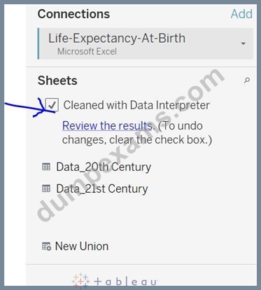
Select the column 1960 to 2000. And Click on the Pivot option
Graphical user interface, text, application Description automatically generated
Rename the two new columns as 'Years' and 'Life Expectancy'
Graphical user interface, application Description automatically generated
Create a Union by dragging the sheet Data_21st Century to Data_20th Century, once you see the orange block for union.
Graphical user interface, text, application, email Description automatically generated
Now, select column 2001 to 2013 and Select Add data to Pivot.
A picture containing graphical user interface Description automatically generated
Select Country and Country Name field, Merge these fields.
Graphical user interface, application Description automatically generated
Rename the merged field as Country.
Let's create the view.
Drop the country to the Filters and Select New Zealand. Drop the years to the columns and 'Life Expectancy' to the Text marks card. Change the aggregation to Avg (it won't make a difference here).
Right-Click on Life Expectancy -> Quick Table Calc -> Moving Average
Again, right-click on it and edit the table calculation.
Graphical user interface, application Description automatically generated
Update the values as:
Graphical user interface, application, Word Description automatically generated
Result is:
Graphical user interface, application, Word Description automatically generated
NEW QUESTION 31
Connect to the "Global Superstore" data source and use the Orders table. Find out how many days in the month of May 2012 were profitable?
- A. 0
- B. 1
- C. 2
- D. 3
Answer: A
Explanation:
Graphical user interface, application Description automatically generated
Here we have created the Fixed LOD expression and fixing the order date. If profit is greater than 0 it means profitable day/month/quarter/year depends on what you need to find. If profit < 0 then not profitable.
Drop the Order Date to the rows and drill-down it till months.
Drop the profitable days field to the Text, aggregated as SUM. So it will find a number of days.
Graphical user interface, application Description automatically generated
NEW QUESTION 32
Which type of sort is applied in the Ship Mode field?
Larger image
- A. Data Source Order
- B. Nested Sort
- C. Field Sort
- D. Alphabetic Sort
Answer: B
Explanation:
Refer to Nested Sort section:
https://help.tableau.com/current/pro/desktop/en-us/sortgroup_sorting_computed_howto.htm
NEW QUESTION 33
In your view, you are using a background image. How can you find the X and Y coordinates on your image?
- A. By annotate an area
- B. Using drop lines
- C. Using custom geocoding
- D. By annotate a point
Answer: D
Explanation:
Explanation
https://help.tableau.com/current/pro/desktop/enus/
bkimages_coordinates.htm#:~:text=Right%2Dclick%20anywhere%20on%20the,Annotation
%20dialog%20box%2C%20click%20OK.
NEW QUESTION 34
Connect to the "WorldBank Data" and use the Development Indicators table. Create a relationship between the avg. birth rate and avg. death rate using scatterplot aggregated at the region level, plot death rate on Y-axis and birth rate on X-axis. Add an exponential trendline and find out how many regions are above the trend line?
- A. 0
- B. 1
- C. 2
- D. 3
Answer: D
Explanation:
Explanation
After following the steps mentioned in the question your view will look like this:
Here, 5 points are above the exponential trend line.
NEW QUESTION 35
I have a view that shows the top 5 countries as per the sales, I also have a region filter, but most of the region filter values we don't need. For example - We don't have any country which is part of the Eastern Europe region. So we want to hide all those regions which are not valid here. How to do it?
Larger image
- A. You will select Only Relevant Values in a filter card options
- B. You will select Exclude Values in a filter card options
- C. You will select Wild card match in a filter card options
- D. You will select Format filter and Set Control in a filter card options
Answer: A
Explanation:
Go to Filter card options, and Select Only Relevant values
Graphical user interface, text, application Description automatically generated
NEW QUESTION 36
Connect to the "Significant Volcano Eruption" data source. Create a histogram using field Death and having a bin size of 500. Find out which country reported 9 deaths in the bin of 0-500?
- A. Chile
- B. Japan
- C. Indonesia
- D. United States
Answer: D
Explanation:
Explanation
Select the measure "Death" and go to the Show Me and Click on Histogram When we are binning the measure, it will create the dimension, so you get a new dimension as Death (bin).
Right-click on this and click on Edit. Update the size of bins to 500.
Graphical user interface, application Description automatically generated
Drop the Country to the color, so our view will look like this:
Chart Description automatically generated
Now drop the Country to the filter and select 4 countries mentioned in our options.
Hover the bar, it shows the United States has reported 9 deaths.
Chart Description automatically generated
NEW QUESTION 37
Why we convert a numeric measure to a dimension?
- A. To show the labels in your view
- B. To use this field in LOD
- C. To aggregate the field
- D. To disaggregate the field
Answer: D
Explanation:
Measures are by default aggregated. We can change measures to dimensions if we want disaggregate that field.
NEW QUESTION 38
Connect to the "Global Superstore" data source and use the Orders table. Create a bar in bar chart and compare the profit against the target profit for Canada Region. Consider target profit is 30% of the sales. Which of the following sub-categories has met or exceed the target profit?
- A. Copiers
- B. Paper
- C. Labels
- D. Tables
Answer: A,C,D
Explanation:
Graphical user interface, application Description automatically generated
Drop Region at the filter and Select Canada
Drop Profit to columns and Sub-Category to Rows
Then drop the target profit to profit axis, it will create the combined axis chart.
Chart, bar chart Description automatically generated with medium confidence
Now drop the Measure Names field from the Rows to the Color Marks Card.
Chart, bar chart Description automatically generated
Go to the Analysis menu -> Stack Marks -> Off (so that your both profit and target profit bars will start from
0)
Graphical user interface Description automatically generated with medium confidence
Tables, Labels and Copiers sub-categories has met or exceed the target profit.
Chart Description automatically generated
NEW QUESTION 39
In a box plot, how we can calculate the length of the Upper whisker?
- A. Upper whisker = (Upper hinge - Lower hinge) + (1.5 * IQR)
- B. Upper whisker = IQR + (1.5 * IQR)
- C. Upper whisker = Upper hinge + (1.5 * IQR)
- D. Upper whisker = Lower hinge + (1.5 * IQR)
Answer: C
Explanation:
Explanation
The upper whiskers extends to 1.5 * IQR

The length of the upper whisker is upper hinge + 1.5 * IQR.
NEW QUESTION 40
In table calculations, partitioning fields define the direction of the calculation.
- A. FALSE
- B. TRUE
Answer: A
Explanation:
Explanation
When you add a table calculation, you must use all dimensions in the level of detail either for partitioning (scoping) or for addressing (direction).
Refer:https://help.tableau.com/current/pro/desktop/enus/
calculations_tablecalculations.htm
NEW QUESTION 41
In Forecast, what is the shaded region?
- A. exponential smoothing
- B. forecast model
- C. none of these
- D. prediction interval
Answer: D
Explanation:
Explanation
Refer:https://help.tableau.com/current/pro/desktop/en-us/forecast_create.htm
NEW QUESTION 42
Which of the following are true regarding custom geocoding and data blending?
- A. In data blending, you can use any data but custom geocoding requires text file based data
- B. You can create new geographic roles both in data blending and custom geocoding
- C. Using custom geocoding, you can plot your own locations on a map but it is not true while using data blending
- D. Using custom geocoding, you can create new geographic hierarchies but it is not true while using data blending
Answer: A,D
Explanation:
Refer to the quick comparison of data blending and custom geocoding -
https://help.tableau.com/current/pro/desktop/en-us/maps_customgeocode_datablend.htm
NEW QUESTION 43
Which of the following are valid calculations?
- A. SUM([Profit]) * 1000
- B. MAX(SUM(Profit), (Sales))
- C. SUM([Profit]) * [Quantity]
- D. SUM([Profit]) * SUM([Quantity])
Answer: A,D
Explanation:
You cannot mix the aggregated and non-aggregated calculations.
MAX(SUM(Profit), (Sales)) -> Profit is aggregated but Sales is not.
SUM([Profit]) * [Quantity] -> Profit is aggregated but Quantity is not.
You can multiply the aggregated/non-aggregated fields with constant. That's why SUM([Profit]) * 1000, is correct.
SUM([Profit]) * SUM([Quantity]) - Both are aggregated
NEW QUESTION 44
Connect to the "Global Superstore" data source and use the Orders table. Create a hierarchy of Segment, Category, Region. Create a crosstab using this hierarchy and add profit, profit ratio fields. Which of the following are true from the below options?
- A. The Central Africa region is having a profit value of $10,709 in the Office Supplies category in the Corporate Segment
- B. The overall lowest profit ratio is of Central Asia region in Furniture Category and Corporate segment (among all the segments)
- C. The overall highest profit ratio is of North Africa region in Technology Category and Corporate segment (among all the segments)
- D. The Southern US is having the third-lowest profit ratio in Technology Category in Home Office Segment and it is having a profit value of $765
Answer: B,D
Explanation:
Create a hierarchy of Segment, Category, Region and drop it into the rows.
Text Description automatically generated
Create profit ratio calculated field:
Graphical user interface, text Description automatically generated
Drop the profit and profit ratio fields to the view, your view will look like this:
Graphical user interface, text, application Description automatically generated
Now let's go through each answer option.
1) The overall lowest profit ratio is of Central Asia region in Furniture Category and Corporate segment - The profit ratio is -142.26% which is lowest overall so it is true.
2) The Southern US is having the third-lowest profit ratio in Technology Category in Home Office Segment and it is having a profit value of $765 - It is true, the profit ratio is 2.06%, which is third-lowest.
3) The Central Africa region is having a profit value of $10,709 in the Office Supplies category in the Corporate Segment - False, it is having a $2,245 profit.
4) The overall highest profit ratio is of North Africa region in Technology Category and Corporate segment - False Note: This is an easy question but time consuming, so attempt these types of questions in the end.
NEW QUESTION 45
......
Desktop-Certified-Associate EXAM DUMPS WITH GUARANTEED SUCCESS: https://www.dumpexams.com/Desktop-Certified-Associate-real-answers.html